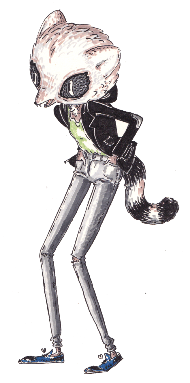
 Hello Everyone, I would like to introduce you to Sheena. The above image is the most current version of her I have made for an animated walk cycle. However originally she was created for a zine. (The images of which you can view on my tumblr or alternatively buy the zine here.) I wanted to create one character that continued throughout the zine like in a comic book. While I have made a few zines before I had never attempted one that focus in on one character; all the images were a bit scattered and not as connected as I would like. So here we go, theses to images below are the very first evolutions of her character. I had decided on a raccoon type character but that was the only limitation at the is point. Of course, creating something that is easy to reproduce ‘easily’ over and over again can be very hard and is a constant consideration when designing. Somehow it just came about that Sheena is a very versatile character design and even though I can never draw her exactly the same twice, she has characteristics that are recognisable even outside of costume. I think that that is very important above all other things. You can see with all these rough sketches below that little things change each iteration and it can make such a difference to the overall design and feel of the character. Even though this can annoy me at times I think the changing nature of her design is appropriate to the nature of life because we are changing everyday and dealing with new situations all the time. I deliberated a lot with the proportions of certain limbs especially the legs and the size of the head compared with the body. Finally I think I struck a balance between her cute bobble headed attitude and the gangly hunched youth she really is. I became fixed on the long bubbly eyes like in some 80’s anime, which I haven’t seen popularised for a while. Along with this I am prone to elongating legs to silly proportions as though the character could topple over at any moment. Most of the time I just can’t resist it however I wanted a little realism in her body (in relation to a humans) but I also wanted to keep it stylised and cartoon-like rather than portraying her as explicitly human with raccoon head; but still having a reference to a human for easier relatibility and an animal nature for a more loveable character. The cover has also evolved from issue one to issue two on the right. I didn’t realise it until the two were sitting side by side. Sure the character design has changed slightly but so has my ability to draw her and more thought is given to the dynamic nature of the pose and drawing as a whole. So it just proves practise does make somewhat perfect (sorry to be cliche but it is a lesson everyone learns for themselves).
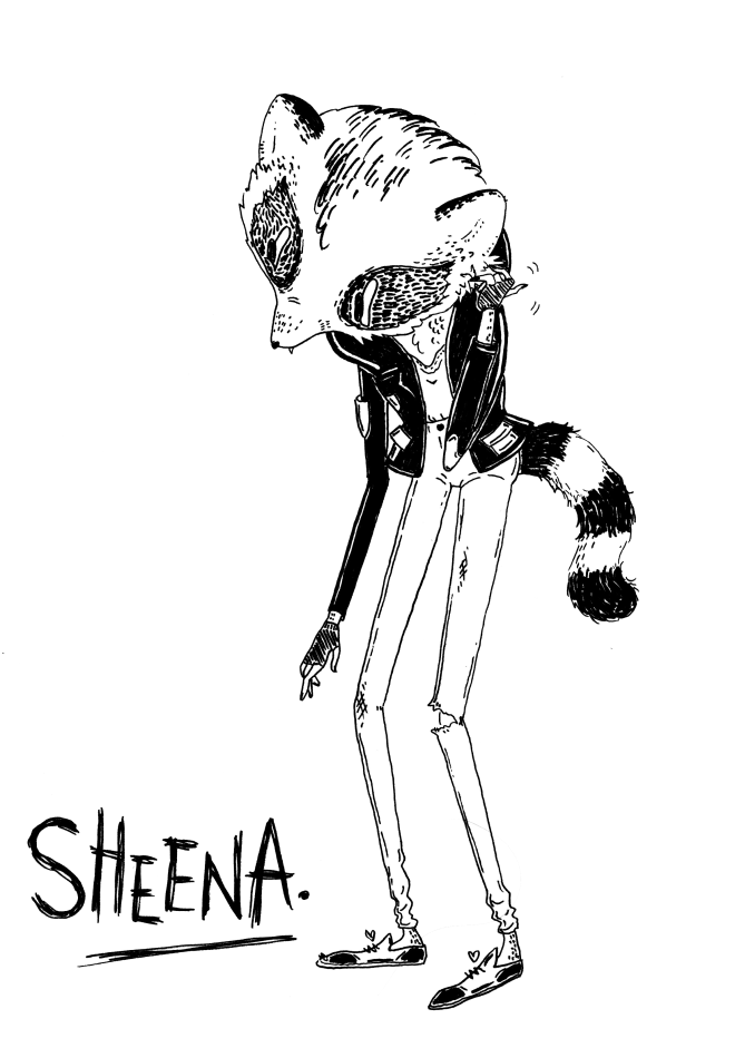
 Hope this was interesting, next time I will talk about her development in terms of personality, attitude and branding. love Katherine
Month: May 2015

Hello readers and viewers, welcome to the dysfunctional world of my creation process! I am an artist, illustrator and animator. This is a site where I am going to share my character and design development. A lot of what I enjoy doing is process-driven and sometimes simply getting an idea on the page is enough. In other words this is the place for all the things that are not polished enough for my website as well as the development leading up to those final pieces.
Thank you for reading,
Love Katherine
