Mermaid Dog Logo Development Part 2

PrintPrint

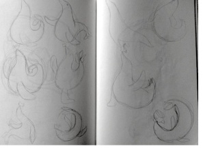
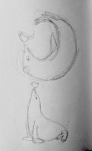
This is what we ended on in my last post, the above images are the base for a logo design I created for the cafe Mermaid Dog in Melbourne’s CBD (50 Market St.) This was the design chosen from all the options from the part 1 post. They then suggested that it be turned around so that the cup is more centred, like the seal is tipping it over. However she I tried it the first time, as in the images below, it didn’t quite work because it was too much tilt. I also experimented with another border idea but it was perhaps too dainty and/or nautical. The banner looked great but was too detailed to be printed onto things like disposable cups so had to scrap that idea too.

Screen Shot 2015-05-29 at 7.35.24 PMScreen Shot 2015-05-29 at 9.46.42 PM

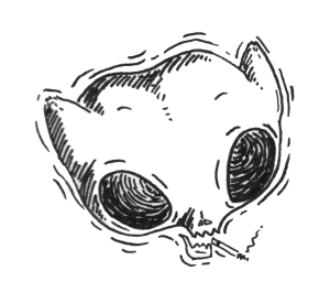
This version (below) is the rotation of the image we decided on which seems just right in terms of balance and symmetry. The border is meant to be an embossed stamp (like a wax seal) which I couldn’t help adding as a little pun, although people have said since that they thought it looked more like a coffee stain/ring. Which is also fine since it relates back to coffee. Now was the time where I had to think about fonts and text styles/placements etc. After experimenting with some script style fonts as requested, I found that most of the were just too detailed and the accents of the letters were just too interfering with the seal image and the symmetry of the two words as a whole. I am only showing two examples here of the fonts I went through but altogether I would have shortlisted about 25. I find the font choosing/designing the hardest part, an image you can manipulate so much easier but fonts are more distinct in terms of whether they work or they don’t. qaskin2 angelface

The two images below are the finals, giving the option of straight or curved text depending on why its being used for. In the end I still chose a script-like font but a simpler more stylised one. The smoothness makes it seem quirky but also sophisticated, a style that I have noticed a lot with recent cafes and other branding wanting to appear fresh & fun but also be taken seriously. Print Print

So stoked that they liked it! (and very grateful they took a chance on me!)

(final design stamped on the cups and printed on a vinyl sticker for the window)

Processed with Moldiv

Hope this post was interesting to see/read for some one.

Katherine ❤

Mermaid Dog Logo Development Part 1: Concept

I recently had the pleasure of working on a logo for some great guys starting up a new cafe in the Melbourne CBD. (where do they fit them all!?) Anyway we were all very happy with the final result which is always ideally what you want. I’m going to share with you the process I went through to come up with the final design. It was a special project because it allowed me a lot of creative freedom and I could also do the style of illustrating I really enjoy. Naturally the first thing I had to think about was kind of branding they wanted and the general feeling they wanted to give viewers about the cafe. The only direction given was the idea of a seal holding a coffee cup on his nose. Obviously I love this idea because it is a pun and involves drawing animals.

photo 2photo 1

These are the first sketches I did, getting a vibe for the movements of seals and what I could do with their bodies etc. A seal is not a rigid animal by any means so most of my sketches turned out rather smooth and organic. I tried to think of fun stylistic ways I could portray the ideals of Mermaid Dog. I imagined it to be a classy and professional place but also friendly and charming. So this called for some whimsy, something appealing to many people, tasteful and trendy but not too cutesy or cartoony (as I have a habit of making things.) These were in the shortlist.

Print Print  PrintPrint

I must confess that I got help from a friend about the stylistic direction I should take and they suggested some old school cross hatching illustration. (the one on the bottom right) Which turned out to be the design that was chosen! So i really owe him and it goes to show that you should never be afraid to ask for help especially if you are relatively new to something like I am to graphic design. In any case the coloured designs I came up with were perhaps too colourful or not quite hitting the mark in terms of believability as a place serious about their food and coffee. I tried to link them to coffee but turning them different shades of brown but that didn’t work out because of the unfortunate shape of a seal. So it turned out that the final design made more sense in terms of its style because it suggests something classy but also chill and quirky; something you can take seriously. The image is self-contained and has more structure and design elements that compliment it such as its circular shape. Sometimes it can be hard to whip things up out of seemingly thin air, with so many variations available to you. Especially if you are a person known for their indecisiveness such as myself. But I learnt that you have to just trust yourself in terms of what looks good and what feels right to the project, rather than sending 100’s of variations to your client. In the next post I will elaborate on refining that final design.

Thanks for reading, if this interested you here is part two.

Katherine ❤

PS: the cafe is up and running on 50 Market lane, Melbourne. Check it out 🙂

Sheena Character Branding Development

killin' it blade

Often when I am writing Sheena I have a specific vibe and references in mind. If some people hadn’t figured it out already the name came from the Ramones song Sheena is a Punk Rocker. I figure that most people wouldn’t make the connection but thats ok really. Its just a guide for the attitude that she has; a grungy (not completely) nihilistic and somewhat shortsighted view of the world. I wanted a strong graphic/comic style to represent her beyond the design of her character which is often whimsical rather than aggressive or graphic. The general vibe of the zines is very important to me; to maintain values and ideals and let the design form itself through those. These images (not mine) might help materialise these feelings I have about Sheena’s character and her origins in terms of style and attitude. Influences such as the 80’s hardcore scene, bands from that era but also one of my all time favourite people Patti Smith. There is just the general vibe of bohemian lifestyle but also DIY aesthetic.

large 040bluePatti+Smith+Group+PattiSmith-260x392 Ramones-the-ramones-1202857_1024_768 screeching-weasel-texas-show-e1389906014461 Suburbia9_zpsbf753b0f Suburbia19838_zpsbead8c68 SW-jolly-roger-BIG-1024x1024 tumblr_ndqnp0zvUF1sgsrdio3_1280

And who could forget the ever-bad-ass Tank Girl.

tg3_40watt tumblr_mb3b9z7xKS1r7as1co1_500

And the gorgeous Lorna comics by Benji Nate, whose character is bad-ass in her own way but also very naive, and unapologetic.

Subconsciously and sometimes not I subverted these values or lack or lack of values and styles into the Sheena zines. It’s not only about being broke and hating everyone, its more than that. There are themes of despondence and inner turmoil; seeming eternal restless and a rejection society’s expectations. For some reason there is satisfaction in the creation of your own world, even if it is a dingy, messy squalor with no respect for any standards or even self care.

Scan 5Scan 6bladelogo

Obviously (to those who know me) the character is based on myself and anecdotes/thoughts from my life. Which I’ll be honest is the only thing I really know how to do at this point. Therefore it is both easy and hard for me to describe her. I know there are a lot of semi-autobiographical comics and zines out there but I hope Sheena makes some impact on some one other than me. I will hesitate from saying that she doesn’t care about anything, only that she pretends not to. She wishes she didn’t care so much. Sheena takes comfort in night time, after all she is a raccoon. It’s when she can try and forget about all her cares once in a while, usually somewhat recklessly. But she’s not as tough and unfeeling as she wants to be, she’s vulnerable and only sometimes wants to admit it. Yet she holds her punk values close to her heart, she feels at home there. Sheena appears alone in almost all of the panels. I’m not sure what this really means, whether it was consciously done or not. I guess all these ‘moments’ are about her reflections on things within herself and thats why. She doesn’t always loathe herself; yet she’s always dissatisfied with something or someone, put herself out too far and only knows how to retreat rather than fight. Just like any character she is full of contradictions, she’s never trying to be anything – but rather trying to understand what she is.

Scan 10 Scan 13

Just an end note to say that I’m glad I decided to use an ink wash over the top of the drawings as you can see what a difference it makes in the above images.

Hope this all made some sense 🙂

Katherine

Character Development: Sheena

Sheena_graphic Hello Everyone, I would like to introduce you to Sheena. The above image is the most current version of her I have made for an animated walk cycle. However originally she was created for a zine. (The images of which you can view on my tumblr or alternatively buy the zine here.) I wanted to create one character that continued throughout the zine like in a comic book. While I have made a few zines before I had never attempted one that focus in on one character; all the images were a bit scattered and not as connected as I would like. So here we go, theses to images below are the very first evolutions of her character. I had decided on a raccoon type character but that was the only limitation at the is point. Scan 2Scan 3 Of course, creating something that is easy to reproduce ‘easily’ over and over again can be very hard and is a constant consideration when designing. Somehow it just came about that Sheena is a very versatile character design and even though I can never draw her exactly the same twice, she has characteristics that are recognisable even outside of costume. I think that that is very important above all other things. You can see with all these rough sketches below that little things change each iteration and it can make such a difference to the overall design and feel of the character. Even though this can annoy me at times I think the changing nature of her design is appropriate to the nature of life because we are changing everyday and dealing with new situations all the time.  Scan 4Scan 5 copy Scan 6 copyScan 7Scan 8 I deliberated a lot with the proportions of certain limbs especially the legs and the size of the head compared with the body. Finally I think I struck a balance between her cute bobble headed attitude and the gangly hunched youth she really is. I became fixed on the long bubbly eyes like in some 80’s anime, which I haven’t seen popularised for a while. Along with this I am prone to elongating legs to silly proportions as though the character could topple over at any moment. Most of the time I just can’t resist it however I wanted a little realism in her body (in relation to a humans) but I also wanted to keep it stylised and cartoon-like rather than portraying her as explicitly human with raccoon head; but still having a reference to a human for easier relatibility and an animal nature for a more loveable character. The cover has also evolved from issue one to issue two on the right. I didn’t realise it until the two were sitting side by side. Sure the character design has changed slightly but so has my ability to draw her and more thought is given to the dynamic nature of the pose and drawing as a whole. So it just proves practise does make somewhat perfect (sorry to be cliche but it is a lesson everyone learns for themselves). covercover 2 
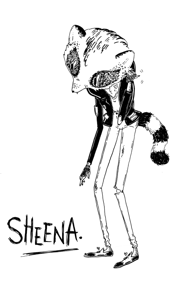
Hope this was interesting, next time I will talk about her development in terms of personality, attitude and branding. love Katherine
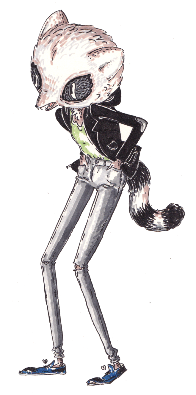