Mermaid Dog Logo Development Part 2

PrintPrint

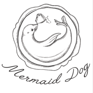
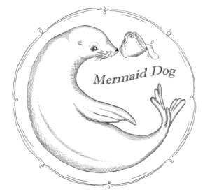
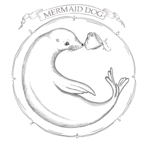
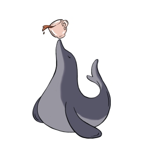
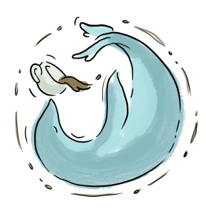
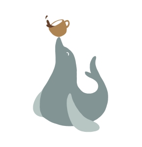
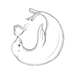
This is what we ended on in my last post, the above images are the base for a logo design I created for the cafe Mermaid Dog in Melbourne’s CBD (50 Market St.) This was the design chosen from all the options from the part 1 post. They then suggested that it be turned around so that the cup is more centred, like the seal is tipping it over. However she I tried it the first time, as in the images below, it didn’t quite work because it was too much tilt. I also experimented with another border idea but it was perhaps too dainty and/or nautical. The banner looked great but was too detailed to be printed onto things like disposable cups so had to scrap that idea too.

Screen Shot 2015-05-29 at 7.35.24 PMScreen Shot 2015-05-29 at 9.46.42 PM

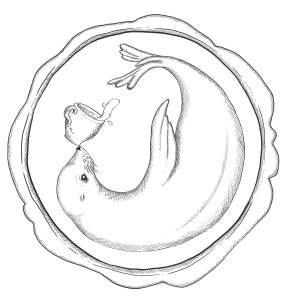
This version (below) is the rotation of the image we decided on which seems just right in terms of balance and symmetry. The border is meant to be an embossed stamp (like a wax seal) which I couldn’t help adding as a little pun, although people have said since that they thought it looked more like a coffee stain/ring. Which is also fine since it relates back to coffee. Now was the time where I had to think about fonts and text styles/placements etc. After experimenting with some script style fonts as requested, I found that most of the were just too detailed and the accents of the letters were just too interfering with the seal image and the symmetry of the two words as a whole. I am only showing two examples here of the fonts I went through but altogether I would have shortlisted about 25. I find the font choosing/designing the hardest part, an image you can manipulate so much easier but fonts are more distinct in terms of whether they work or they don’t. qaskin2 angelface
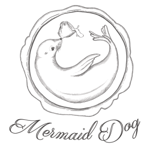
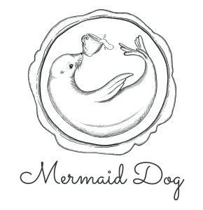
The two images below are the finals, giving the option of straight or curved text depending on why its being used for. In the end I still chose a script-like font but a simpler more stylised one. The smoothness makes it seem quirky but also sophisticated, a style that I have noticed a lot with recent cafes and other branding wanting to appear fresh & fun but also be taken seriously. Print Print
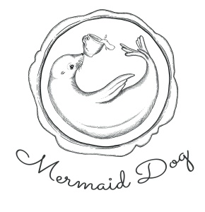
So stoked that they liked it! (and very grateful they took a chance on me!)

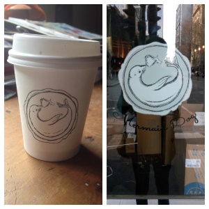
(final design stamped on the cups and printed on a vinyl sticker for the window)

Processed with Moldiv

Hope this post was interesting to see/read for some one.

Katherine ❤
Mermaid Dog Logo Development Part 1: Concept

I recently had the pleasure of working on a logo for some great guys starting up a new cafe in the Melbourne CBD. (where do they fit them all!?) Anyway we were all very happy with the final result which is always ideally what you want. I’m going to share with you the process I went through to come up with the final design. It was a special project because it allowed me a lot of creative freedom and I could also do the style of illustrating I really enjoy. Naturally the first thing I had to think about was kind of branding they wanted and the general feeling they wanted to give viewers about the cafe. The only direction given was the idea of a seal holding a coffee cup on his nose. Obviously I love this idea because it is a pun and involves drawing animals.

photo 2photo 1

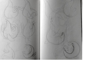
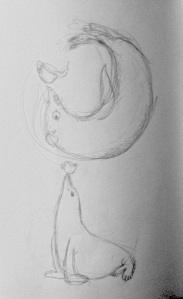
These are the first sketches I did, getting a vibe for the movements of seals and what I could do with their bodies etc. A seal is not a rigid animal by any means so most of my sketches turned out rather smooth and organic. I tried to think of fun stylistic ways I could portray the ideals of Mermaid Dog. I imagined it to be a classy and professional place but also friendly and charming. So this called for some whimsy, something appealing to many people, tasteful and trendy but not too cutesy or cartoony (as I have a habit of making things.) These were in the shortlist.

Print Print  PrintPrint

I must confess that I got help from a friend about the stylistic direction I should take and they suggested some old school cross hatching illustration. (the one on the bottom right) Which turned out to be the design that was chosen! So i really owe him and it goes to show that you should never be afraid to ask for help especially if you are relatively new to something like I am to graphic design. In any case the coloured designs I came up with were perhaps too colourful or not quite hitting the mark in terms of believability as a place serious about their food and coffee. I tried to link them to coffee but turning them different shades of brown but that didn’t work out because of the unfortunate shape of a seal. So it turned out that the final design made more sense in terms of its style because it suggests something classy but also chill and quirky; something you can take seriously. The image is self-contained and has more structure and design elements that compliment it such as its circular shape. Sometimes it can be hard to whip things up out of seemingly thin air, with so many variations available to you. Especially if you are a person known for their indecisiveness such as myself. But I learnt that you have to just trust yourself in terms of what looks good and what feels right to the project, rather than sending 100’s of variations to your client. In the next post I will elaborate on refining that final design.

Thanks for reading, if this interested you here is part two.

Katherine ❤

PS: the cafe is up and running on 50 Market lane, Melbourne. Check it out 🙂